Table of Contents
Did you know around 252,000 new websites are created every day worldwide? Users establish an opinion about your website in roughly 50 milliseconds (ms) (0.05 seconds), which decides whether they will stay or depart.
Good UX design will attract more users and help to improve the overall ROI. As the renowned UX/Product designer Miklos Philips stated that “every dollar invested on UX returns between $2 and $100.”
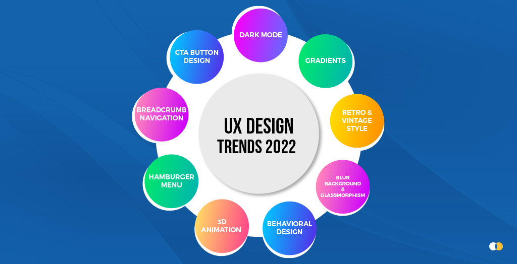
Top UX Design Trends 2022
Technology evolves at a rapid pace, and website design trends are no exception.
One of the most rapidly changing trends in the world is UX design trends. Frequently, new trends emerge! To start with, we’ve compiled the most popular UX design trends to uplift your business presence in 2022.
1. Dark Mode
Have you noticed that your screen has become darker recently? You are not alone. The use of the dark mode is becoming increasingly popular. Dark mode design is growing in popularity with operating systems, apps, and browsers. For instance, Apple now has a dark mode in Apple’s iOS and MacOS operating systems.
Dark mode website design is more than just picking a black background color with a value of pure black and calling it a day. What works for one dark mode website design solution might not work for another. Get expert UX design services if you are unsure about the dark mode selection.
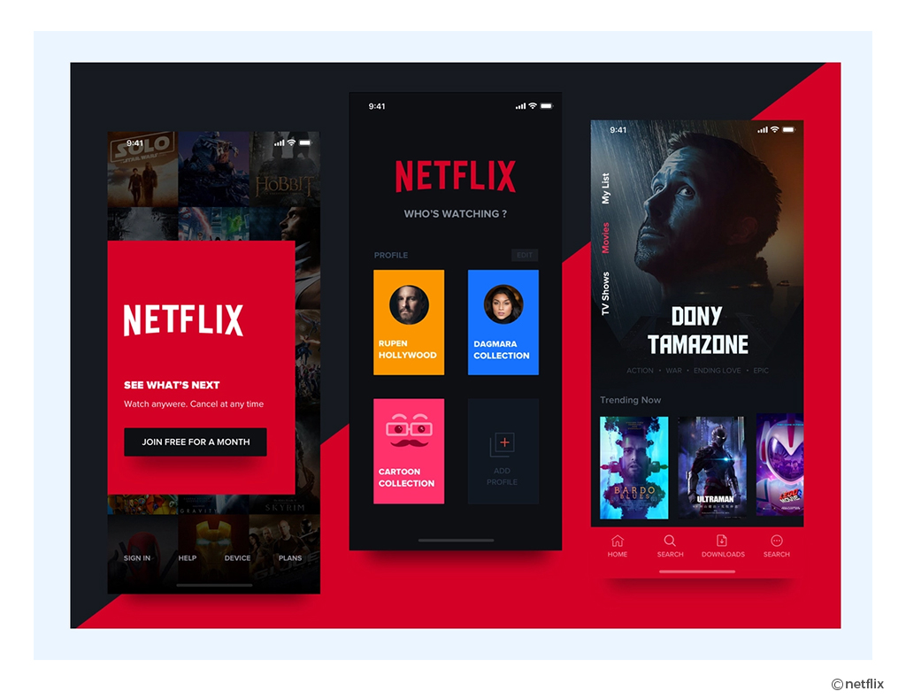
If you want to establish a brand that gives people the impression of being dramatic, mysterious, or sophisticated, the perfect example is Netflix.
The majority of Netflix customers view episodes online at night or in dimly lit environments, which is why Netflix has implemented dark mode in their websites or apps.
Netflix uses dark mode to provide a seamless experience from the screen to the rest of the environment, recognizing that users will be streaming in this type of scenario.
The darker UI on these streaming sites not only helps to recreate the cinematic sensation of being in a theater, but it is also easier for the eyes to watch the videos in the given environment.
To implement dark mode on your website it is very important to understand how long your users will scroll or be on your website or apps.
In a nutshell, Dark Mode is a new feature that is popping up all over the place, claiming to help increase visibility. It makes easier to stay focused, and even reduce eye strain. — but regardless of the claims, the message is clear: Dark Mode is for everyone. As a result, more websites are jumping on board.
2. Gradients
A gradient is a design element that consists of colors that fade into one another over time. Gradients, also known as “color progressions” or “color ramps”. These are made up of different shades of the same color or multiple colors that blend into each other. Gradient colors on a website are eye-catching and thus keep users engaged.
Gradients are one of the most popular graphic design trends. They are memorable, make a strong statement, and evoke emotions in users, allowing them to connect with a concept or product. Gradients, when utilized correctly, may make your site look trendy and have a big impact on your visitors.
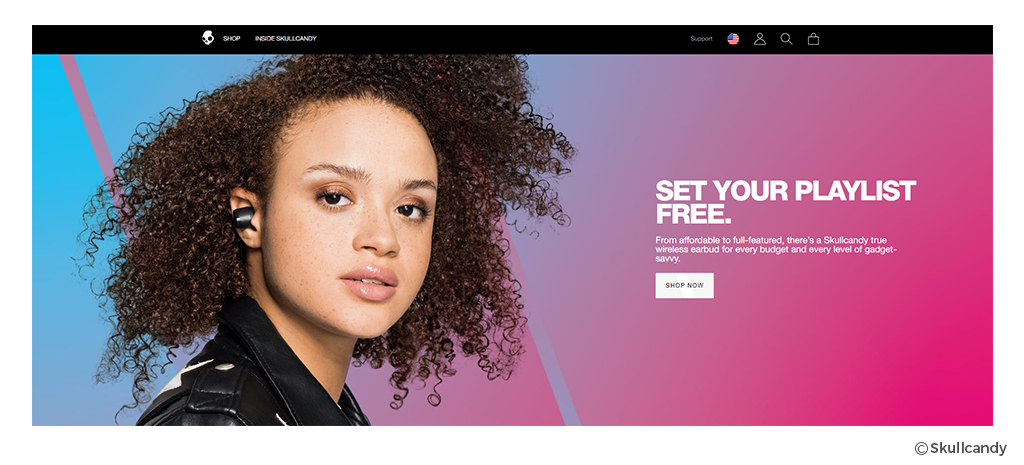
Take a look at how Skullcandy has combined a variety of appealing colors in the example below:
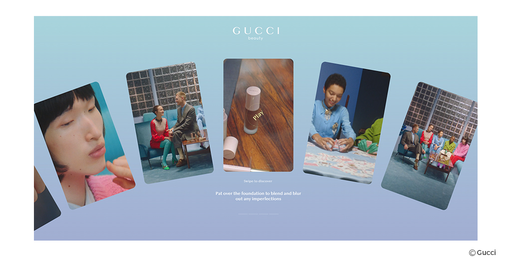
Another excellent example is Gucci Beauty Foundation’s website, which makes excellent use of gradient design to draw customers’ attention.
The background transforms into a colorful gradient that changes every few seconds. Although each shown image, i.e. card, has a vibrant color palette and the vibrancy of the gradients is not affected. The content on the cards appears even more prominent, grabbing the viewer’s attention right away.
The site includes a quiz, as well as video tutorials and interactive color picker palettes — all of the creative and clever ways to increase user interaction.
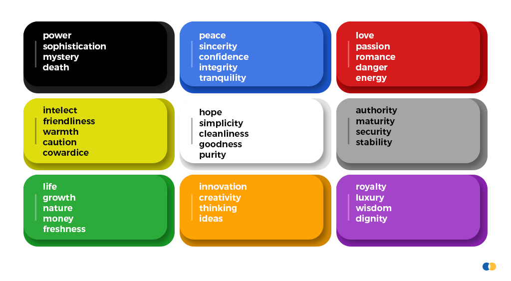
As gradients are all about colors, pick your colors wisely when designing your website. It has to match the tone of a particular page or product element. If you’re not sure what to choose, go for UX design services.
Below is a great example to brief about different color platelets:
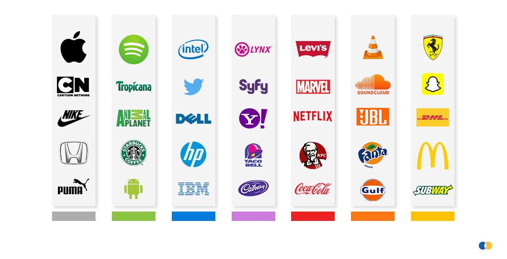
Here you can see how the biggest of global brands have chosen their brand colors:
The company’s website and logo color influence the brand’s perception. One should consider the psychological and cultural implications of colors you select for your brand and website.
3. Retro and Vintage Style
In recent years, the retro theme has boomed, with nostalgic themes becoming popular in fashion, photography, and video.
Websites that use older style images, fonts, colors, layouts, and typography are referred to as “retro” or “vintage”. This design style has grown in popularity because of its ability to evoke a variety of emotions and appeal to site visitors.
Most web designers use retro features to rapidly attract the user’s attention and show products, advertising, and other page material in an immersive style that motivates users to click CTA buttons, converting visits into sales.
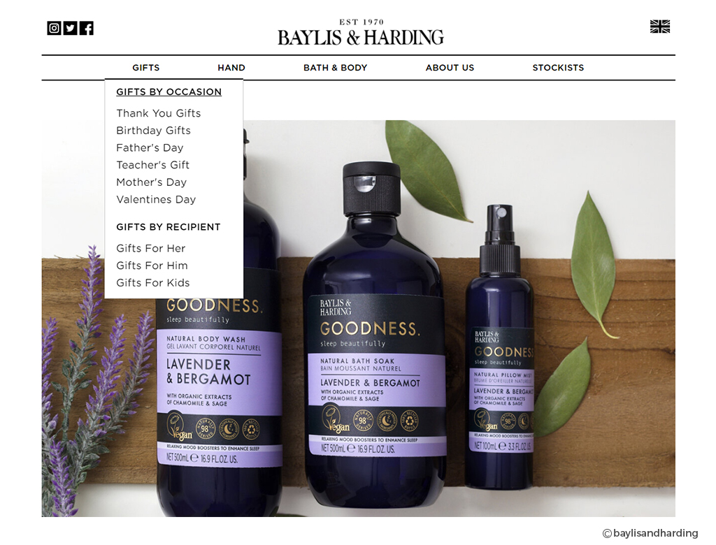
Founded in the 1960s, Baylis & Harding has been providing wonderful cosmetics to people all over the world for more than 50 years. While other companies have evolved and modernized to keep up with the times, Baylis & Harding strategically maintains its historic style in order to give clients the sense of trust that comes with buying from an old acquaintance.
In the image above, you can see how well they’ve retained the retro design style with only a black and white motif, which takes us back to the classical period. You can also visit Baylis and Harding’s website to learn more about retro style.
Retro styles evoke recollections of the past for website visitors, which can help them form a stable emotional bond with the site—yet another path to higher conversion rates!
4. Blur Background & Glassmorphism
The term “glassmorphism” refers to user interface design that favors light or black objects over colorful backdrops. The objects are given a backdrop-blur that allows the background to shine through, giving the effect of frosted glass.
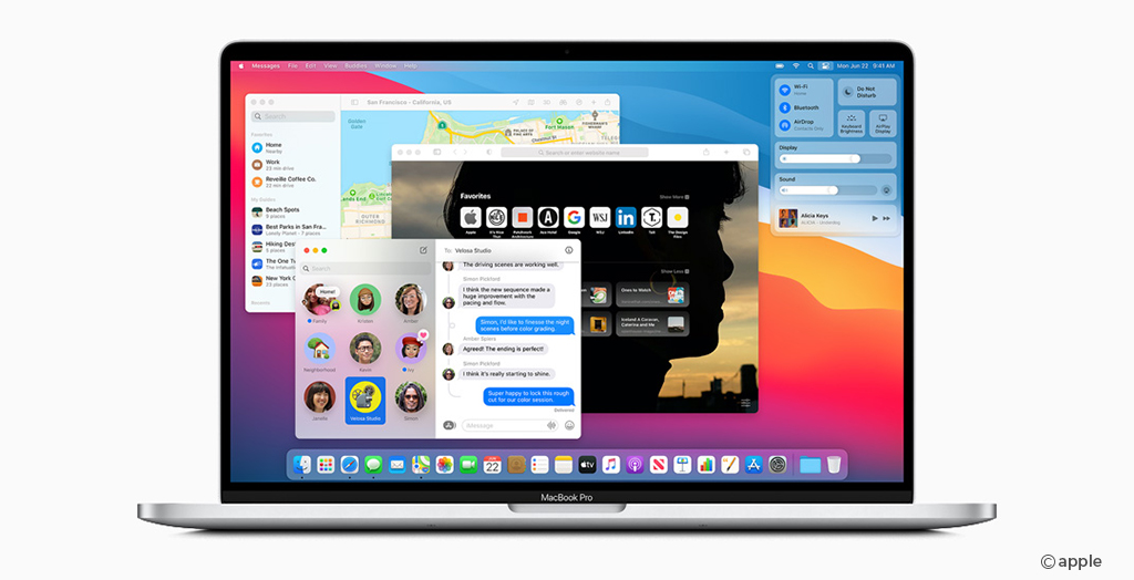
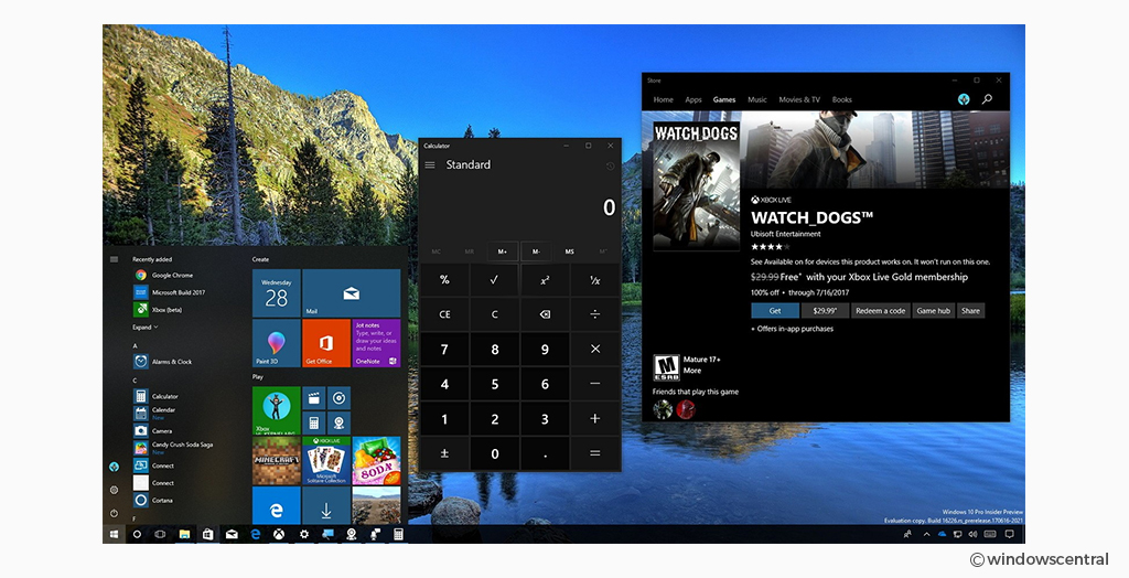
Big companies like Apple in its macOS Big Sur update and Microsoft in its new fluent design system embrace this popular style called Glassmorphism.
For example websites, Apple is using the technique to display the most appealing elements of this new interface, which is eye-catching when combined with vibrant graphics and forms.
Microsoft in the below image is also using the same technique to display the most appealing elements of this new interface, which is eye-catching when combined with vibrant graphics and forms.
5. Behavioral Design
User behavior is a tricky yet crucial part of user experience design. Many usability changes are dependent on the user’s behavior. It is defined as how they view, think, and react to your product.
User behavior is being used by many companies to build products, and design experiments that drive behavior change and growth. It’s an end-to-end approach to product development that encourages teams to think about their customers from a usability perspective.
Companies have realized the importance of understanding the user’s behavior. Gone are the days when people used to rely simply on calendar alerts and handwritten notes. Businesses are continuing to collect people’s data and analyze user behavior in this competitive industry. Ultimately, it provides value to users and boost product engagement.
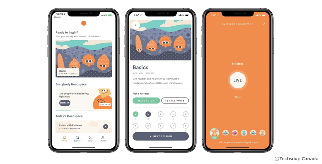
Many businesses and popular companies like Headspace have used behavioral design for their websites and apps. The platform’s popularity stems from its ability to keep customers engaged by urging them to meditate every day. Personalized daily playlists, analytics, meditation history, and even the ability to sync schedules with “buddies” are among the techniques used.
Headspace is an excellent example of a digital product that understands its users’ habits and how to entice them to participate.
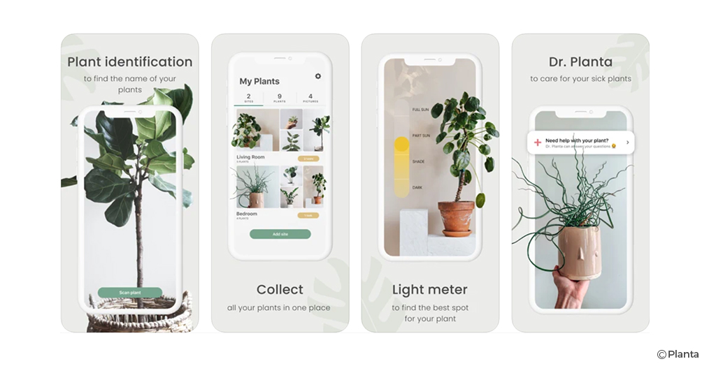
Also, a popular app called Planta helps users to keep track of the different types of plants you have at home. Basically it track the light intensity of the room in which they’re situated. Users receives push notifications when it’s time to water them based on the weather in your location.
This strategy is commonly used to develop products and apps to assist consumers in achieving their goals.
6. 3D Animation
Website interfaces and user experience can both benefit from 3D animation. 3D animations can thrill and surprise users on your website.
In the previous year, 3D animation has become highly popular. More and more websites are using animations, videos, and 3D objects to give a truly unique user experience.
The 3D design provides a sense of beauty and elegance to the objects on display, as well as allowing you to attract potential consumers’ attention and provide them with significant, in-depth, 360-degree information about your products and their use in the real world.
we can take the video showcasing the 3d effects from their website
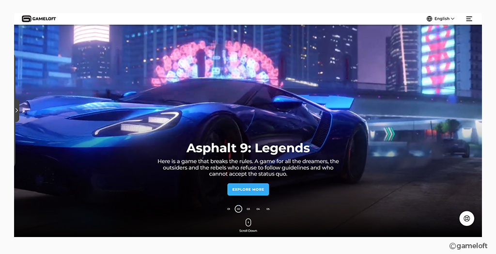
Gameloft has implemented 3D animation design on their website. Lots of design techniques are taking place on their homepage alone, a slideshow background with moving photos, 3D effects, and rotating text… And it’s all quite lovely.
How could anyone look at this homepage and not want to go deeper into the site? When all of these 3D animation designs are used, you’ll want to keep going and reading more of the website.
3D animation is becoming popular because it works. Thus, 3D animation is a new need for your business.
7. Hamburger Menu
When it comes to integrating all navigation links in one spot, companies prefer the Hamburger navigation menu. This menu is stylish, dynamic, and mobile-friendly, and as a result, it draws a lot of user attention because it is both stylish and realistic.
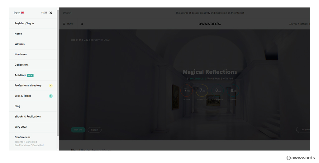
A well-known website Awwards, a collection of interesting and creative designs templates. This website is designed in a minimalistic style. They reduce all additional noise to focus the user’s attention on the content. To do this, they chose to go for a hamburger menu.
One of Awwwards’ best features is the addition of a “Menu” label to the menu icon. This input makes navigating simple and thorough, and hence transparent.
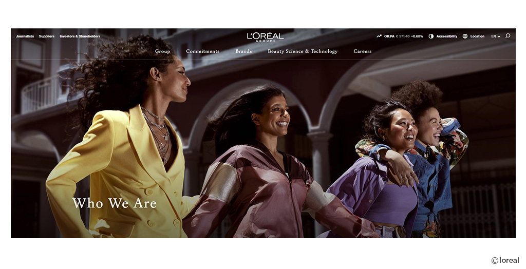
Another excellent example of the well-known Loreal brand. When you first visit the L’Oreal website, you’ll see a three-lined hamburger menu icon at the top of the page. The color of the icon changes when you hover over it, making the user experience more interactive and enjoyable.
When you click on an arrow symbol, you’ll get a menu with many navigational items and subcategories. The overall navigation is well-structured and clutter-free thanks to its architecture.
8. Breadcrumb Navigation
Breadcrumbs are an important aspect of your site’s navigation and user experience
It is a secondary navigation menu. Breadcrumb navigation improves the discoverability of your landing pages by allowing people to quickly go to higher-level pages if they came to your site via search.
Breadcrumb navigation makes it simple for visitors to comprehend the relationship between their current location on a page (such as a product page) and higher-level pages (a category page, for instance).
However, the navigation helps you reduce the bounce rate on your website and gives users a stunning experience of browsing various categories.
Different Types of Breadcrumb Navigation:
- Attribute based
- Hierarchy based
- History based
Breadcrumbs also improve SEO performance. Just as users, crawlers, or search engine robots benefit from having an easy way to navigate through a site. By tracking links around the web, these crawlers find content for the search engine. The crawlers can follow a defined path created by a hierarchy of breadcrumb links.
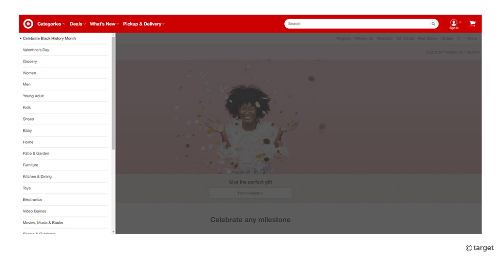
For example: When we click on the “categories” that is the breadcrumb navigation on target.com and when you click on a category, it will reveal numerous options, so you can choose the one that best suits your needs.
If you click on the options you are looking for it will redirect to that page. Breadcrumb navigation is the best navigation bar that helps users to navigate the website without any trouble.
 9. CTA Button Design
A call-to-action (CTA) button is an interactive UI feature usually seen on both devices- web and mobile. Its main goal is to persuade users to take specific actions that result in a conversion for a specific page or screen, such as purchasing, contacting, or subscribing.
What should be the location of CTA on your website? Which situations are appropriate for each of your CTAs? and do all of these things matter in terms of conversions?
- Subscription CTA
- Learn more CTA
- Purchase CTA
- Social sharing CTA
- Form CTA
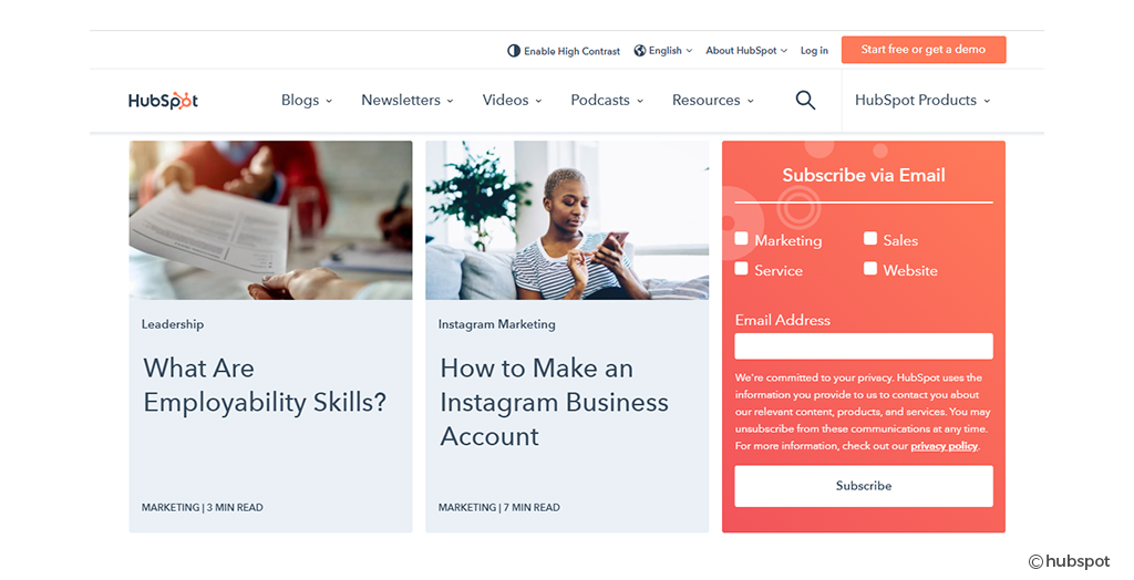
The purpose of the subscription CTA button is to attract more subscribers. Below is the fine example of the HubSpot website:
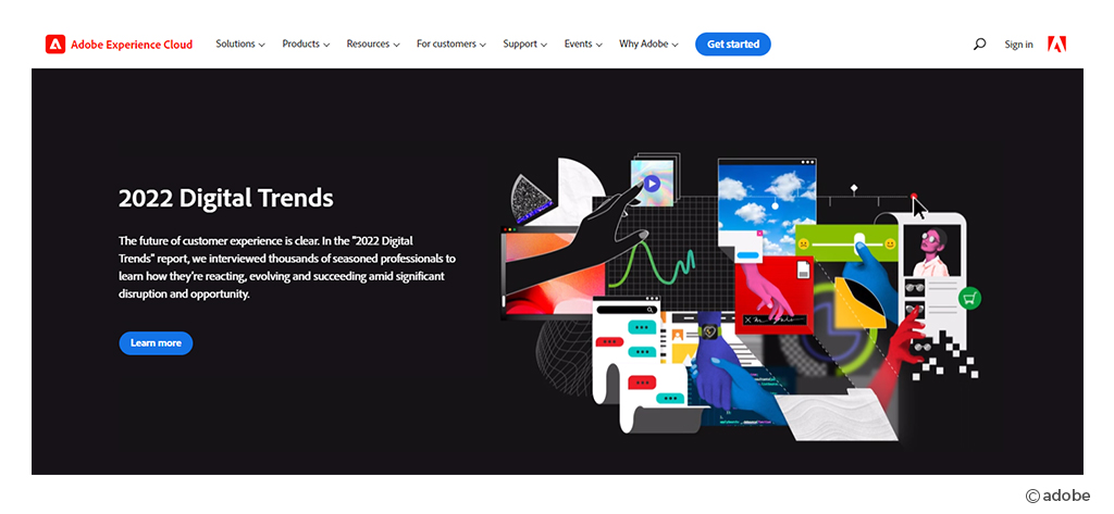
CTAs are best to showcase detailed information of particular products or services. Below is the fine example of Adobe Experience Cloud:
Social sharing CTA are very important because if visitors find your content valuable and informative. They are more likely to share it on their social media profiles, promoting your business and increasing user engagement.
Moreover, you can provide a subscription option for users to opt for the company’s newsletter. This is how you can inform your users to stay updated with the latest updates and industry best practices right in their inbox.
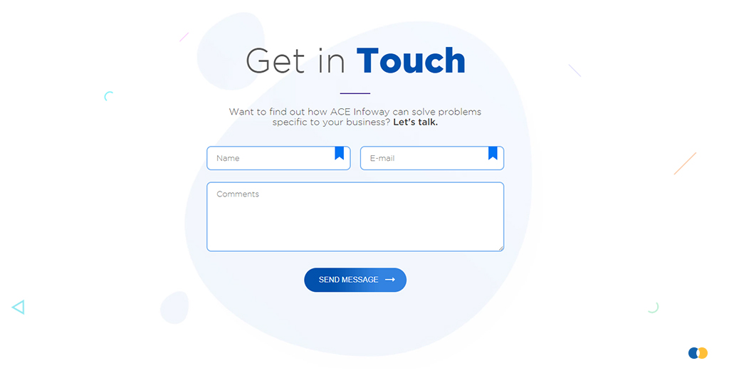
Form CTA is the ideal way to collect customers’ information, which you can then use for promotional purposes in the future.
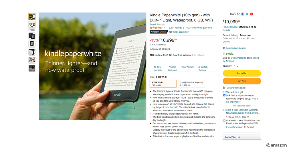
After successfully attracting people to your website using the various CTAs outlined above, it’s now time to nurture them into customers. Purchasing CTAs is essentially lead nurturing activities. Below is a fine example of Amazon Kindle:
Conclusions
You are now familiar with various web design trends that help you boost conversions and attract more visitors to your website. However, keep in mind that there’s no need to rush when it comes to implementing any of the above designs on your website. It doesn’t matter how remarkable a trend is if it doesn’t improve the user experience on your website.
The first impression of your website matters a lot, hire the best UX consulting services to help you choose the best suitable UX design trends.
Looking to design a stunning website? Team up with us to create a compelling web design strategy with an execution roadmap to magnify your brand presence and amplify your business impact.


